There’s something about early digital watches that really attracts me, mostly because they can look so interesting. Often full of complications and with amazing dial designs, which for me is possibly the most important aspect of these creations. How to display the most relevant information or data to the user, without causing confusion – and still make the function of it, or the “user interface” as they say today, both easy to read, understand and also intuitive to use.
Not an easy task.
Here are a few that for me manage that task pretty well.
Early Citizen D060 Windsurfer, Timex (later) T49976 Expedition, Early Citizen D100 Promaster Windsurfer
And yes they are all quartz, battery powered and every so often you have to change the battery – it can be daunting, though once you get the hang of the user logic, these ones are actually easy to manage. Sometimes there are printed highlight notes on the module reminding you to short out this or that, or push all buttons prior to setting up and so on, though that’s basically to clear memory and rarely affects the basic time function.
Any time a battery needs changing – it’s – clear the desk workspace – take care and concentrate. But seeing the display come to life again and then scrolling through the various functions and reminding yourself just what these modules can do, is always a pleasure.
Casio vintage Alarm Chrono, had tough times but still good!
With a reasonable collection of digitals from the late 1970’s onwards, you can see the dial contrast improvements and the creation of more intuitive commands, to manage this or that function, though I’m still bowled over by some of the early ones and realize just how good they are.
I’m not going to go through the functions and so on, but rather just show here a small photo gallery of some of the ones I’ve collected over the years. The dials say it all really and there are many more, many covering all sorts of sports and pastimes, but increasingly difficult to find these in really good condition. They are not expensive and as a result tend to get worn “hard”, often not surviving. Often as not, if the module goes, so does the watch – into the trash, which is a pity as they are a testament to the ingenuity of the first Quartz sports watch pioneers.
Many are Japan made and although there are many, many lookalike digitals around from China, none of them have the pedigree of these or indeed the quality of the Japanese modules and displays, which in their day, were truly science fiction, and particularly in the actual design.
Rare watches today as they represent a time of change and great innovation and ridiculously accurate for their time too, which is a real bonus. Usually wherever I go when wearing one of these, people comment and mostly they are rather impressed. Not bad after some 40+ years of plastic/resin moulding, early display technology and large battery styles – I take my hat off to them – great!
Note – I have probably featured these somewhere in the web site at some time as a Post. For more information, just use search.
I often trawl through the weird and wonderful watches that appear from time to time, where the old analog idea of hour and minute hand is sort of forgotten about.
And we have the sometimes preposterous methods for showing, telling or indicating the passage of time, which at first glance (and you’ll need a few glances I can tell you), it is nigh impossible to read the time.
You also get some rather ingenious ways too, but mostly the common denominator is the fact – it’s haystack time! and you’ve got to find the needle! The needle being the time!
To the young it may be fashionable and I’m sure a topic of conversation (do the young actually converse face to face any more?), a talking point, as all your friends gather round to see if they can make out what time it is. However to my old peepers, I would be better squinting at a kaleidoscope via an illegal substance overdose!
Now what time is it?
Xeric Trappist Monk Moonphase – and tells the time I think.
(1) Apparently the Trappist Monk here tells you the time with the window @6 showing the Hours and the planets or stars somehow showing the Minutes. I haven’t managed to see it myself yet, but I’m sure if I had time, I might figure it out. Love the colors and the sky design and all that – but . . . .
Seems ironic for me that the watch dial is really large and OK it looks intriguing, but the time telling bits are so small in comparison, it ends up with such a small set of indicators, you certainly can’t just glance at this to get the time. If you can get it at all!
(2) The next guy is the Last Laugh Tattoo by Mr Jones,
Mr Jones – Last Laugh Tattoo
which though colorful and has lots of symbolism tattoo stuff, to me seems to be an exercise in how to hide, not show, the time.
Once you have your glasses on you can just make out the Hours on the top set of teeth and the Minutes on the lower set.
But again we have the repeating theme of a large dial area with only a tiny fraction used as the time indicator, so really good eyesight required for this one.
Always remember here, before designers get carried away, that the prerequisite for a watch is first and foremost – to tell the time. So to my mind these first two have not really managed to meet the brief.
Now I’m all for trying to indicate time in a different way, just for a change if nothing else, but making the time indicators either too small or hidden in some way doesn’t seem the right way to go about it.
(3) Next is the Xeric Soloscope, which is a tricky one and it also requires very good eyesight indeed to read. On this model and on the face of it, the Hours should be relatively easy to spot, being circled by that single hand BUT it’s only actually effective when directly over the Hour numeral as shown here (7). When it’s between Hours, say 15 minutes past the hour – Ah, then it’s very tricky indeed! Because the circle itself partly obscures the very thin index you’re trying to see and there’s no numeral to see. Each line of the index denotes 5 minutes by the way.
Soloscope – a tricky read indeed.
So basically this is an overly fancy single hand watch – and I’ve had them before, bought for the novelty, but which unfortunately I’ve always found in practice soon wears off – and I’ve sold every one of them on to some other novelty seeker.
I suppose if you’re OK with a vague approximation of the time, when someone asks – you’re answer is “Oh it’s after 7 sometime” – which maybe sounds OK, but if the inquirer is catching a plane – not so clever.
(4) Now this one is a little different. Not easy to see at first, but none of them are, but this one has purpose, as it caters for the visually impaired, so seeing it, is somewhat irrelevant.
Bradleys Classic Black Mesh
This is the Eone Bradley Classic Black Mesh with it’s inside, outside “silver balls” that you can feel with your fingers. The outer one on the edge of the case, indicates the Hour and the inner one, the Minutes (assuming a 12 hour clock dial). The dial is matte black and has raised markers and an strongly embossed diamond at 12, so it has a Braille touch style, which really does assist those with impaired vision. Obviously there is no glass/crystal here as the fingers can feel the raised numeral markers and the ball on the dial.
So this is a model that has genuine purpose in reading time in a different and very useful manner.
(5) OK this is the last one is probably the best one for me, because it’s relatively readable and is an older idea seen on quite a few vintage watches.
This is the Klokers Klok 01-D1 Yellow Matte Black Leather – which is an update of the old disc watch, where Hour, Minute and Seconds discs move round a large dial and pass underneath a vertical fixed pointer which highlights the time.
Just read down vertically from the top – this one looks to me to be about 10.20 and almost 30 seconds, so can give quite an accurate time. Mind you to pick out the seconds it really has to be read. Personally I’d prefer the numbers to be in a heavier font with more contrast – but that might just be me.
A quick glance, however, should give you the 10:20 bit, which is probably accurate enough for most of us.
Also this watch is a “mobile” – which is evident as the discs rotate, but unlike hands, these rotate anti-clockwise, which is a bit odd when first seen. Also each disc rotates at a different speed!
So, OK, I accept it can be a little tricky at first to get your head round these odd movements, but once on board you suddenly get the picture. It’s also a decent full dial size at 44 mm diameter, which helps.
Personally this one has an attraction for me. And maybe I like it because it shows time actually passing, which can be quite fascinating. And this is because, as I said, the disks constantly revolve and at different speeds – as I say – fascinating.
Disc watches truly involve you in the process of time itself, and if you like mobiles it’s very much cheaper than a Tourbillon!
The only downside I’ve found with the odd disc watch I’ve owned is their timekeeping. The discs have to revolve smoothly and without touching an adjacent disk and depending on the quality of manufacture, play is sometimes unavoidable, so accuracy can suffer a little.
But if it’s a quartz model it has at least a good basis to start with, the mechanics are minimal and should still be accurate enough for most of us – just check it every fortnight, if the mechanics are not quite to the same standard.
So there we are, just a selection of unconventional watch dials, guaranteed to confuse the elderly 😉
Of course I jest. These are unusual watches and inject a bit of interest and sometimes humor into what can be a tedious procession of clocks and watches that can be quite boring at times.
And as I haven’t had a disc watch for many years, I could be tempted by the Klok – just for fun.
And it’s also sobering that if you can see time actually moving – you’re still here!
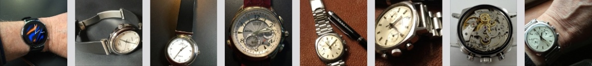
Odd name for a watch I know and not being in the know these days, unfathomable to me, but those folks at Timex marketing have come up with it and it sounds good. . . . For me it differentiates it a little from the Expedition series, one of which I already own. And as my Expedition is one of my very favorite watches, from anybody, I thought that a look at this one in this “Transit” guise would be worth a look.
The Timex Ironman Transit
Here they’ve removed the tough looking macho “shock” exterior and replaced it with the running, fitness orientated modern man look that seems to be the thing today (the only thing I run now is a bath and this website!). I have to admit I like it’s clean looks and easy to read dial with large digits on a very clear display, something that I feel Timex leads the way over all others. The contrast is good and the displayed information gives the Day, the Date and the Year, plus the time – what more do you need on a quick glance.
And that’s something you can do with this watch – a quick glance is all you need and bingo – no squinting at it, trying to make out poor digits against a poor background. This is for me the way to go in digital displays. And once the daylight fades you can use the Timex patented Indiglo dial lighting system, which I have to admit is brilliant on their digital watches (not so good on their analog ones though – see my views at the foot of this Post).
I also like the operation of this Indiglo function. If in a dark place during the day for example, a press of the center colored button and the dial lights up for 3 seconds. But later in the day you can activate the system fully by pressing the center Indiglo button for 4 seconds and what this means is that pressing any button on the watch will light the dial. So no fumbling around looking for that one button – any of ’em will do – the dial light again will illuminate for 3 seconds at a time. The Indiglo system will stay activated (as a system) for the next 8 hours or until you switch it off (4 seconds press of the center button again).
I quite like this degree of control, which my old Expedition one lacks (or I haven’t noticed it!) 😦
Functions on the watch are useful, such as a Countdown Timer and a Stopwatch (sports) with a 10 lap memory, a few Alarms and the watch also has a 100 m Water Resistance which is pretty good. Not a diving watch, but it’s OK to shower with it or swim in the local pool or even on the beach. If beach swimming just remember the salt water doesn’t do anything much good (apart from aching feet), so a rinse in fresh water is a good idea afterwards.
A little chunky perhaps (added to by the under body fast wrap strap), but at 40mm very comfortable.
The watch dimensions are just 40 mm diameter which is a little neater than some of the older models and it comes with one of those very useful “Fast Wrap” straps. When I first saw these I didn’t know whether I’d like them, but I do. They are quick and comfortable and usually better than a strap and buckle arrangement, unless they fray, which has been known.
So this is a practical watch from Timex and it’s easy to wear, very easy to see, day or night. Has enough useful features and functions on it, a decent Water Resistance and at a price of under £50 has to be a really good daily beater in any language.
Note –
I mentioned the Indiglo system of dial illumination and I said it was great on this model and most other Timex digital dial watches. But as I said I’ve always found it to be a great disappointment on any of the non-digital analog models.
The reason is that the standard analog watch tends to have hour and minute hands, either colored steel , skeletal or a combination of both PLUS a luminous looking tip or pointer. The numerals and markers are similar and if it is a Date watch with Date window – forget trying to read the Date at night.
Indiglo lights up the background dial surface in a sort of fluorescent green and shows everything on the dial as black silhouette and I have to say, not that easy to see. The hands, numerals and markers are simply not at a decent enough contrast to this greenish background (makes my eyes go funny) and forget about any so called luminous tips to the hands – these are also dark.
And the date is virtually black and unreadable.
On this watch, which is digital, it is brilliant, as is my Expedition, which is a joy to use at night. So a case of technology where it’s needed basically and my maxim is simple – for Digital display Indiglo is OK, but for analog display, good luminous coating or Tritium is the best.
Just my opinion and you take it or leave it, but one thing I can’t abide – is not being able to read the time day or night – and I’ve had a few models over the years that manage that feat. I don’t have them now!
But as to the Ironman Transit – it has to be great value and you don’t look as it you’re in the Army . . . . You’ve just joined the fitness people!
Each year I tend to have a look around the offerings by the Swatch Group, but concentrating not on their high end portfolio, but rather on the Swatch in-house Brand . This is the one started life back in 1989 with the introduction of 12 new models. The start of a range of watches from Switzerland, produced to counter the mass influx of cheap quartz watches from Asia. Termed Swatch to infer “second watch” at a low competitive price point, a Swiss movement and a true “Made in Switzerland” logo. It was a successful ploy and they have produced millions of successfully selling watches ever since.
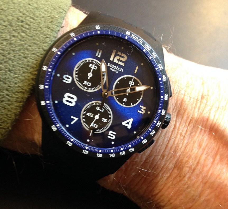
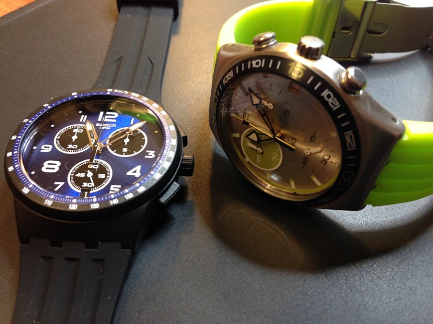
The Swatch Nightspeed blue black
Swatch introduce new models often and you can usually guarantee good quality, a good movement and an affordable price. So this year I looked to see what would take my fancy and be my model for this year (it might not be a 2018 build, but one I maybe missed in the past).
This time I’ve gone for a black plastic cased, quartz powered model, called the Nightspeed. I find it to be a very attractive dark toned blue dial within a black case with a black silicon buckle strap. I particularly like this strap as it’s very, very flexible, has a nice mat black finish and the Swatch (through) buckle fitting.
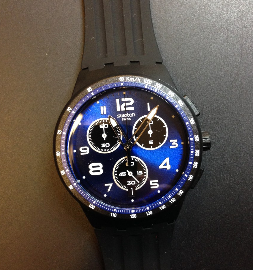
Quick change battery hatch – with battery type inscribed on back.
The dial numerals are in white with two different font sizes, the 12, 4 and 8 being larger. There are three sub-dials with running seconds at 6, and the two at 2 and 10 function as stop-watch counters. There is also a date window at 6 with white against black and most of the dial features are luminous. There is a black stop-watch seconds centre sweep hand and the semi skeleton hour and minute hands have white tipped pointers.
There is a finely marked dial bezel featuring a Km/h marker ring and there are two black pushers on the right, either side of the centre crown for timing functions and setting the watch.
Light weight plastic body – easy on the wrist. Note the date window @6.
Whilst the colour scheme is predominantly black and blue, the white features within the dial make this an easy watch to read. Overall it is both understated and yet very attractive.
The dimensions are 42 mm diameter and just over 13 mm depth including the slightly domed crystal, so a nicely sized watch and being plastic cased is very light on the wrist.
According to the data on the Seller’s website, the Water Resistance is quoted as 30m, though with the Swatch quick change battery “hatch” as opposed to a full screw back, I’d be cautious it testing how good that may be!
One neat point to note is the battery type (394) is inscribed along-side the hatch, which is very useful.
The Swatch 4 jewel Quartz movements, I’ve found and certainly the ones I own are both accurate and reliable . . . . which when put together with the general attributes of this particular model, I am certain will be a great model to own and at around £80 represents a good buy.
Just a note – if you are looking for a watch to match colours with clothing, it is a fact that generally the Swatch range give you a great choice, as they do offer an extraordinary number of models in all sorts of colour options. Just a thought for Christmas. . . .
After my European travels a month or so ago, I have got myself another one of those wonderful ONE Handed watches for which I seem to have a love/hate relationship. I say this as I had a similar model to this some years ago, but got rid of it for the same reason I bought it – that One handed design. So what’s changed?
This is the MeisterSinger model Neo Q,
MeisterSinger Neo Q One Handed model
which again is One handed but this one is quartz powered, so low maintenance (stick it on the wrist and forget). However the main difference from my old mechanical Perigraph model is that it is NOT Perigraph.
And because of this fact the dial is much simplified and for me that is the whole point of single hand. It IS easier to read. And to assist in this aspect it has new typography too with much clearer lettering and now sports a round Date window @6 which suits the overall look.
Note the undercut case – allows perfect strap fitting.Neat, stainless steel, undercut case, suede leather strap.
This model is stainless steel cased and is a neat 36 mm diameter, which being honest is a perfect size for the average wrist. It is beautifully finished, sleek and smooth with a suede leather buckle strap. My model here is the black dial with white hands and numerals – it was a toss up between the normal white with black notifications, but I chose this version.
It IS however a delight to read. It is very easy to so do and very clear. Each hour is divided into quarter, half and three quarters and in between these into 5 minute segments – and it is surprisingly accurate to read. Not having a second hand means that unlike most quartz models there is no jerky ticking of the second hand – instead the Hour hand (no minute hand either) very slowly and majestically sweeps around the hours with a rather stylish grace that I find very agreeable.
Note on the image the case top is a larger diameter than the underside. This is because the case profile is undercut, allowing perfect fitting of the straight cut strap. Also the strap features a quick release fitting spring-bar.
This model is not luminous which is an omission in my opinion, but basically this is a dress watch, hence the lowly 3 Bar water resistance, but certainly adequate for the intended purpose.
Every so often I like to trawl the swatch world, just to see what low price models take my fancy. I like Swatch as the quality is invariably at a decent level as to ensure a good and reliable timepiece. Their quartz models in my opinion are almost always good value and more often that not, great fun to wear. Slightly funky colour-ways mean that if you are even a tiny bit dress conscious , then these can make a rather neat and subtle statement that you ain’t finished yet!
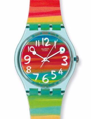
Unisex Colour the Sky Swatch model Quartz.
This is the GS124 or the Swatch Unisex “Colour my Sky” quartz model – available for anywhere between £30 and £40 and OK is a basic 3 hand model without Day or Date, but has got lots of colour, both dial and strap. Dimensions just 34 mm x 8.75 mm depth, this is a very neat watch and will fit anyone. (and don’t be thinking this is too small – some of the best Patek’s are 34 mm!).
It is what it is and that of course defines the ever so quirky Swatch range. The back has the usual coin screw battery access and the case is sort of see-through plastic and the dial layout works pretty well with the slight odd hands set up. In fact this one has a touch of the old “railway” clock look about it and is pretty easy to read.
I like it.
My next Swatch pick is the oddly named “Lonely Desert” (Day & Date) model (SUOB721) which is I suppose more gents that Unisex, though that said, is not a large watch either at 41 mm diameter by 9.85 mm depth, so still a neat wearing model. Price wise not a lot more than the first watch featured, but has the advantage of the Day and Date window.
Swatch Gents “Lonely Desert” Quartz.
I like this one as it features a leather strap in a really neat shade of “leather brown” that works well with the dark case. The dial is silvered and the Day and Date window stands out really well with white letters against a black background. This is a slightly more serious watch model than the colour sky idea and looks really good either in casual or in a formal setting.
The usual coin battery access at the back –
Typical Swatch coin battery access.
Here’s a pic of the typical Swatch battery hatch system.
So just a couple of models from the huge Swatch range that caught my eye, both very affordable, Quartz powered and yet quite different.
I have to admit to a liking for quite a few of the Swatch Day and Date watches as they really do represent great value for money, especially when coupled to a quality standard that seems to stand up proudly on it’s own merit.
I have a few friends who collect Swatches (sad I know . . .) and I reckon most of us know someone who probably has more than one and I suppose it must be gratifying to Swatch themselves as the “S” or second “Watch” idea (Swatch) has turned out to be such a success story.
I’ll probably feature a few more of the ones that I like – and you never know, you might like the odd one too.
Vintage watches are still my passion and perhaps more so today than ever, simply because many are from an age where “style” and “elegance” were as important as the watch function itself. And I have to admit I like that.
Neat but good sized Ladies 1920’s 18K Vulcain manual wind in original condition
This example is a 1920’s Ladies 18ct Gold Vulcain which has survived in very good condition and is being worn today, keeping good time and looking as elegant as when it was made. I guess it was produced just after WW1 when Vulcain moved to their new factory, so possibly around 1923 or so, once the new premises was fully up and running.
This model is a bit of a rarity with this case shape, though checking through the Vulcain “Book” I found this very similar model from around 1930. Note the early Vulcain logo in a simple font without underlining etc.
1930’s Vulcain with diamond decoration – from the Vulcain “book”.
Another reference I found is from the Watch Book – “Wristwatches – A Handbook and Price Guide” 6th Edition of Gisbert L. Brunner & Christian Pfeiffer-Belli, printed by Schiffer, which although listed as anonymous, could indeed be a Vulcain such is the similarity.
Similar cased & dial look of the 1920’s
My Vulcain 18K Gold cased is also complimented by the expandable bracelet (marked DV, which denotes a Vulcain parts or accessory) which suits it perfectly with no degradation to the spring action or the fastening clip and safety chain. (note the Trademark DV with the V on top shown is prior to the rectangular form, which appeared in 1934).
Original Vulcain accessories (DV) 18k Gold expandable bracelet
The case back is numbered and hinged with a snap closure and the movement is in very good condition considering this watch is not water resistant.
Vulcain of course is a very old established Watch Company formed back in 1858 and still producing high quality watches today. Famous amongst other things for producing the 1st practical mechanical Alarm watch, the Cricket” – which could be heard over 30 metres away and operated without disturbing the time keeping of the watch, both features thought impossible. After many years of research it finally was introduced commercially in 1947.
So all in all very pleased with this purchase as once again it is relatively rare, both in shape and style and is in excellent running condition. What’s more it appears that the original bracelet is attached and the watch has obviously been kept for special occasions as it has worn exceptionally well over the best part of the last 100 years.
The last image shows a Gents Vulcain from around the same vintage, again with the original Vulcain logo on the dial and very similar font applications on the dial. Note too the hands and dial colour are virtually identical, which were obviously the parts of choice at this period.
I’ll keep a look out for this particular Gents model and if it comes up at any time – I’ll be very interested in adding it to my collection. You never know!
Gents 18ct Gold 1925 model (Illustration – from the Vulcain “Book”)
Every so often I feel I want to brighten up my watch wardrobe, especially if I’m out for dinner and maybe even dressed for the occasion. Something that maybe we don’t do often enough these days and certainly something I don’t do enough, being retired. Years of going to the day job, dressed up, tends to make one “dress down” when in retirement and maybe even to forget the odd shave – very remiss.
What to wear? Well this will do nicely ‘cos it’ll go with anything . . . .
But with age comes a certain freedom, where that silly old soul can wear an outrageous bow tie with a blazer or have an overly elaborate walking cane (never had one before, but what the heck!). Maybe you can make some amazing, amusing or cutting comment that could well be in the category of – “You can’t say that!” – that’s awful . . . . ! And get away with it.
And so it is with the choice of watch on your wrist, which neatly brings me to this model – the Swatch “Rounds & Squares” SUON122.
Swatch “Rounds & Squares” model – for geeks.
An ultra modernist Quartz in silicon, plastic, with an abstract style with a blue case and multi-colour strap and an every colour dial. The ultra lightweight case will manage a 3bar Water Resistance, so should withstand the odd glass of bubbly thrown at it, or even if the wearer might accidentally (or was he pushed?) fall in the pool. Now OK the watch survivability might be around 50%, which oddly enough is probably about the same (or better) as the old wearer . . .
It has a centre seconds hand and a neat little screw (coin) hatch at the back to access the battery and the strap as seen here is just fab’ and amazingly flexible.
Did I just use the F word? Goodness, is that sad or what . . . . I mean I was old when they started using that!
Coin battery entry hatch – easy fit even for me!
Anyway as watches go it’s a pretty decent size at 41 mm diameter and commendably just under 10 mm thick, AND it’s plastic, but without the over size silly “ooh is that a watch then?” look, a style that frankly has lost it’s charm for me – but this is different AND it looks good!
Yes this Swiss offering actually looks great – it’s bright, it’s colourful and OK, perhaps a little OTT (did I mention the second hand is “pastel blue?) but despite all that unbelievably I can think of lots of old guy eccentric clothing to go with it. I’ll look some out later . . . .
So being in a sort of dark mood the other day, I went and bought it, sad I know, but that’s what happens when faced with a hypnotic strap such as this.
How could you do it, I hear you ask?
Swatch that goes with – everything!
Well it was like this. I spotted it when having lunch with a friend – a friend who is an Ex geek. I know the ex idea seems bizarre but there he was, wearing believe it or not one of those ghastly Hawaii style Miami Vice era multi-colour, but long sleeved, shirts (the rest of his attire was no less incongruous – long shorts and hiking boots – and this is March in Scotland!).
Anyway it happened as my companion asked him the time and as a result I sort of did a double take, as my ex geek pal pulled up his shirt cuff and looked at this continuation of his – “shirt”?
But NO – he was actually looking at his nice new Swatch watch, which was virtually indistinguishable from his riotously bright outfit, in almost every way! And as I say – I was hooked . . . . . It was a lousy day, wet, dark and utterly miserable and there he was – a riot of colour, watch and all!
Well when I got home I looked it up, loved the colour, price OK and ordered one on the spot – and would you believe it – I was already starting to feel much brighter myself.
It came directly from Swatch in tick tock land, so took a couple of days.
Now perhaps it’s a cheap (relatively) and definitely cheerful watch of course, but it’s also absolutely a bit of fun to wear and it will do me nicely, oh yes, it’ll do me just fine.
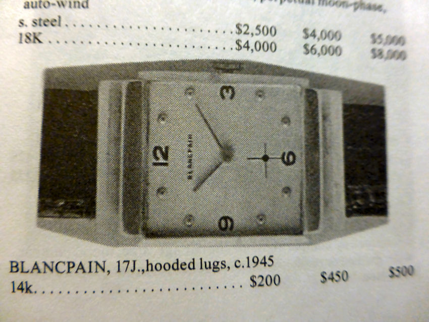
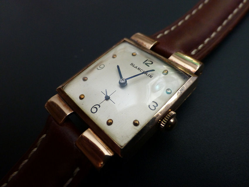
Yes here was I thinking that Blancpain produced only round case watches. I checked around however and with some difficulty it has to be said I did find an image example in my old No 30 Edition Gilbert, Engle & Schugart “Complete Price Guide to Watches” on page 677 right at the foot of the page, an image of almost the very same model. It too has hooded lugs, though shown complete rather than the part hooded ones of my version.
Gilbert, Engle 2010 Watch Catalogue – illustration of vintage Blancpain model
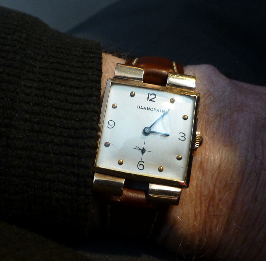
However the dial is exactly the same, stick hands dot markers and the tiny sub-dial seconds, plus the 4 cardinal numerals. The glass is unscratched and domed and the solid 14k Gold case is in great condition. A degree of re-finish is evident and why not as this watch is from around the 1940-45 era. The strap is not a Blancpain but a modern Italian leather Rosario 18 mm that looks just fine. As always with any watch I collect – it has to be worn on the wrist regularly and Rosario straps are always comfortable.
Blancpain vintage rectangular c 1945
The movement which is in superb condition is signed Blancpain 17 jewel unadjusted with the Rayville SA import mark clearly shown (KXO). I’m not sure if Blancpain even made their own movements in this period and the movement looks very similar to an A. Schild. It does look as if it could be related to the AS 970 for example, though I’m no expert on these and there were so many AS movement variations, I can’t definitely put a number to it, but they were of very decent quality for the period.
1940s Blancpain signed 17 jewel – perhaps Anton Schild.
The case has been cleaned up at some point in the past, but the Case Maker marks show up clearly to be Katz & Ogush Inc of New York, who were registered in 17th January 1921, and denotes the 14k Gold motif. K&O had two different motifs – the other was simply plain text with their initials, so this is a nice bonus for me as I have a thing about Watch Case Maker marks.
Katz & Ogush Case Maker for Blancpain c 1945
When I first saw the images on Auction I thought perhaps this was a Ladies model, but the watch overall size at 26 mm x 35 mm lug to lug, is definitely for a Gent.
It was also produced at the time when the “formed” watch style was coming in to fashion, as they moved away from the traditional round pocket watch style of earlier times. Of all the shapes around at the time and into the fifties, the square and rectangular became the most popular and are still with us today.
So to say I was pleased in an understatement – I am delighted with my vintage find this month.
It’s not often you find a rectangular Blancpain and movement wise it is in great condition, the case is clearly marked with a known Case Maker and it’s in good condition – it also keeps excellent time which is another bonus.
The question of absolute original condition and refinished condition always comes up when collecting vintage watches. It is a fact that to find watches in “perfect” condition of this age is becoming almost impossible now. More often than not the watch is in various stages of poor condition, corroded movements, spotted dials, mechanical damage, scratches and dents and certainly not looking at all as it was when made. The question you have to ask is – Do I want it looking like that? And in my case – Do I want to wear it?
Personally as a “wearing” watch collector, I prefer the watch to look more or less as it was. And I don’t mean completely refinished in such a way as to look false, but rather cleaned up sympathetically, basically to show the attributes of the original watch.
I also don’t mean to replace everything on it, but where possible to refurbish the existing elements to best advantage.
Rectangular 14k Gold Blancpain c1945
The only time I would tend to accept the absolute original, would be for very much older pieces, such as a few pre -1900 models. I have some and these 1800’s models are about as original as you can get and “as found” and are the only watches I own that I don’t wear.
They are (unfortunately) for display purposes only. I suppose I got these when I first started collecting and had this exciting “purist” idea, but I soon found that firstly it was a VERY expensive and perhaps over-optimistic collecting idea. Secondly I realized that wearing watches was my real passion so had to revise my strategy and not look too far back – and of course it’s cheaper!
But for me, more fun . . . . .
Note – One of the problems with vintage watches is the degree of uncertainty when checking them out. You have to be a bit of a detective and maybe a skeptic too, which is a pity. It would be so nice to accept things at face value, but that would be unrealistic. There are some things on this model that could make you wonder, one of which is evidence of machine holes/marks on the rear of the dial. Are they related to the fitted movement and dial? Well yes they are in this case and are actually the reverse of the dot marker positions on the dial. If you look closely at the markers they are not just “applied” markers, but are in fact punched “through” the dial itself. And that’s about as permanent as you can get.
So maybe after all this is me being too Sherlock Holmesy, but this sort of thing does makes you question – But as I say happily every aspect of this case and dial was perfectly consistent with the watch. Though had they not been you have to remember it was the middle/end period of the 2nd World war, watch cases and parts may not have been easy to get and to assemble a complete watch might well involve a certain degree of “mix and match”.
I might have to go along with the fact it may – and I say may – have had a very light and sympathetic dial refurbishment and that is absolutely fine by me – in fact I love it.
So after close examination I think I’ve got myself a really nice and genuine example of a rather rare watch – AND I can wear it – so I’m happy.
One of the nice things I like about Longines, is their trick of producing high quality watches at affordable prices. And that’s what we’ve got here with this vintage Auction find for under a £100. I say value for money as I spotted a pre-owned one, co-incidentally just the other day from a Retailer, for £450 and this one is in far better condition.
Very neat Longines Conquest quartz Date watch – c 1992?
This is the Longines 1992-4 Conquest Date model in stainless steel, with the Longines L1.161.4, 6 jewel ETA quartz movement. Slipped into a sleek well finished stainless case that’s only at around 5.32 mm thick is what I call neat. In fact the entire watch is neat at just around 34 mm (excl. crown)in diameter. This version has the original Longines French made leather strap, with the proprietary deployment clasp with twin button release. Note this is a bespoke strap as it has to fit the lug case design with the centre cut out. I also noted when searching this model on Google it’s actually rare indeed to find a strapped version, as almost every one I’ve seen comes fitted to a Longines bracelet.
Neat Longines Conquest with 5.32mm thick stainless case & original deployment fitting.
Anyway this watch is in pretty much perfect condition with no marks or scratches at all (I hasten to add that the images shown are as I bought it, uncleaned), the Sapphire crystal is perfect and there are no intrusion marks on the back, which is also pristine. The fact there are no intervention marks is a real bonus, as so often ex Auction pieces have had a few over zealous buyers poking around them with their penknives! (Yes! it happens – I’ve seen it! and that really annoys me!).
The deployment strap is not actually damaged but is very oily/dirty with accumulated crud from obviously been worn 24/7 by the previous owner, so do I try and clean it or not?
Original Longines deployment fit – with quick release adjuster.
The Longines branded deployment clasp itself is actually very good and I note it doesn’t have your typical friction fit clamp adjustment. It is more subtle than that. To alter the fit length you have to push in one of the pushers (it’s marked with a little arrow) which allows the small push-button assembly to lift out. Once out, re-position the deployment over the strap hole you want, then pop it back in – job done.
Now whilst I am a great believer in deployment clasps for certain styles of watch and even with this one being rather good, on this very slim model it tends to defeat the purpose. I find that deployments can hold the strap away from the wrist by virtue of the fitting itself and in this case, as it’s such a neat, super thin and almost delicate watch So, I decided to fit a standard Longines leather strap and buckle instead.
And I was lucky enough to have a superb original leather one salvaged from another Longines with the correct end fit profile sitting in my spares drawer which will be ideal. Note – shown fitted with photograph at Post end.
Uncleaned as yet, but showing no scratches or marks – perfect!
So an excellent Auction buy, quartz it may be but it is a very high quality one and great value.
Longines watches are still and always have been undervalued in my opinion, which fortunately makes them a good choice when looking for a pre-owned watch. And I mean this for both quartz and mechanical models. Part of the reason is that they are not sold at inflated prices and even new they represent good value as the quality is really, really good and the closer you get to one, the better they look.
Looks good on the wrist at just 34 mm diameter.
This particular model is from the early 1990s and as good today as when it was made and I have to say there is a certain “comfortable quality” about it. What I mean is just everything about the watch feels right. The smoothness of the silky satin finished stainless steel case case, the rounded edges, the elegantly designed dial, subtle luminous markers and hands, it really is a sweet little watch for men or women.
So this purchase was both a surprise and a delight. A surprise as it was so cheap to actually get and a delight, in that once seen, in your hand, then worn on the wrist, the realisation that this watch is a keeper, no question.
Longines stainless buckle alternative to deployment.
Note– it is important when checking the serial number of this model, it is NOT the the obvious one on the case back, which yes, it does have between 5 and 8 numerals. Though conversely the movement calibre IS on the back.
To date the watch, you need the number On the movement module itself, so you need to snap off the back and check it on the movement module.


 This is the
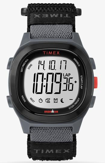


You must be logged in to post a comment.