You can’t be serious?

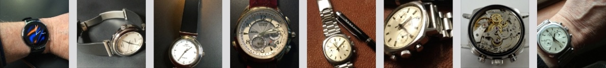
Yes, just looking at what’s supposed to be available this year in the Smart watches category and as before I’m still very disappointed.  I decided not to get lots of images of the latest offerings as they all look much the same to me and certainly don’t inspire me to want to even contemplate buying one.

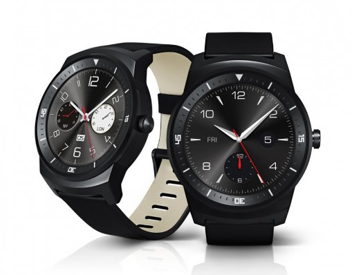
But it’s the same old battery life issue that stops this so called “smart” revolution dead in it’s tracks.  Some of them are boasting “superb” battery life at just 3 days, maybe even a week with mono display models.  LG for example use one of the largest batteries yet at 410mAh and it struggles at 2½ days if you want to use the screen for anything.  The Pebble Time boasts a week – maybe and when I saw one the other day, I thought at first it was an old LED model as he wore it blank faced all day and probably hoped nobody would ask him the time.

I mean – really?

I feel a John McEnroe coming on – “You can’t be serious!”

Ashampoo_Snap_2016.03.19_15h01m06s_002_
Asus ZenWatch – BUT let down with very poor battery life – shame as it looks OK.
Ashampoo_Snap_2016.03.19_14h56m50s_001_
LG smart watches

Unfortunately I am and this is the real issue and not one that will be solved readily.  Even using the very latest new fangled processor technology you’re only talking of hours improvement at best.

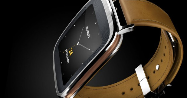
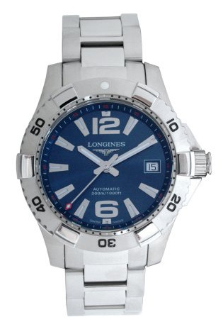
OK I have included 2 images of smart watches after all, basically as they don’t look too bad, but I include them here for that fact alone and absolutely nothing to do with whether they are any good or actually of any use.   I also note that many of these watches are already suffering from AMOLED screen burn where the bright displays are causing screen problems – like my old PC used to have a screen saver to try and prevent.  The Asus Zen is particularly prone to this and as a consequence moves pixels around to try and compensate – but this in turn causes screen clarity issues.

As I’ve said many times before, this whole Smart Watch technology is basically a work in progress and under development.  And I would further suggest it will be a considerable time before these quite major issues are resolved – battery life being the big one.   I also question the entire idea and necessity for an intermediate device between your wrist and your pocket, where your smart phone resides and which incidentally has a far better battery life than the so called “smart” watch and it has all the software required to actually do something with it.

At this moment in time I just don’t see the point.

But if battery life was suddenly increased to a couple of years or even just one, then who knows.  But to have all this expense just so my wrist can tell me I have an email or a message, when my phone in my pocket has already buzzed to let me know anyway?  Come  on . . . . .

Smart or not so smart?

Well, later this year we are going to be inundated with these peculiar little gadgets called Smart Watches, though to me it seems almost more like a surrealistic exercise in technology for technologies sake.   A test of just what else we can miniaturize and stick on the wrist.Collage
Now Smart Phones I understand. I mean these were initially small portable phones using a cell and tower transmitter system, that allowed you the freedom NOT to be tied to the office land line.  This then expanded to take link capabilities with Bluetooth then via WiFi to allow integration with other devices and communication with the Internet – and OK all useful in a progressive sort of way.

But now to insist that what we need is another smaller device – a Smart Watch – to attach to your wrist, that will allow you to communicate to your Cell/Smart Phone that’s in your pocket? just a short reach away and probably reached with the same the wrist is attached to – frankly seems bizzarre.

That this “Smart Watch” tries so hard to partly duplicate the features of the Smart Phone and generally failing miserably in that regard, as the main functionality is fully contained IN the Smart Phone already, which begs the question – Why try?

Now if the Smart Phone was tethered to your house – OK, this is fine – but Hey! we’ve done that already – it’s called the Smart nee Cell Phone!

Hellooo!  your phone is in your pocket!

I have to suspect we’re all getting carried away and just a tad silly, possibly unreal – and let’s be honest that’s what we’ve got to get back to – reality.   We don’t need it!   Or more accurately I don’t need it – and I’m a registered, paid up gadget freak!

Now if it this so called Smart Watch took the place of the Smart Phone, completely, then Ooo..K, it’s just possible though debatable it might be handier than the phone in your pocket – and there are some around now that apparently can do just that.

Google Glass
Google Glass

Though another option might be the spectacles or glasses idea (Google) on your face (IF you want to wear the thing), though again it would have to supersede the SmartPhone completely – now that too might be a viable option in future years (maybe next year by the speed things are moving!).

I just have the feeling that whatever we do over the immediate few months and year is disappointingly going to be a series of stop gaps – and being a cynical sort of guy these days, maybe more a transient retail incentive, to cough up for the development costs of all this new technology, most of which will be out of date before you can say –

“Virtual Communication Implant with virtual HUD capabilities” or VCI(HUD) – because that’s what’s coming next – Oh Yes!

OK maybe not this year, but perhaps in 3 to 5  . . . .  No watch or cell phone required, but rather a virtual projection system in front of your eyes, surgically implanted just above the ear . . .

Wow! – and I’m thinking here it might make my golf easier too with all the course and hole data right there!   With HUD Head Up Display info in 3D projection!

Talk about having your head in the clouds!

I think I’ll give it a miss for now and anyway I’ve got to make a call – now where IS that phone?

A quick glance?

Why is it that many of the “New” watches, “cool” watches, or “unusual” watches appear to have the same problem – you can’t tell the darned time on them.   Or at least it seems that way to me as to read them takes an age of staring at the dial until you figure it out.   I mean what is the point of that?  You know we’re trying to read the time, not waste it trying . . . .

I like to have a quick glance at my watch to tell the time – it’s that simple!

Let’s look at a few examples – of a couple of models that require a lot more than a “quick glance”.   First the Deja Vu watch @ around £100.

The Deja Vu
The Deja Vu

Well I look at this one and I simply don’t see the point and whats more I find it quite difficult to decipher the time and that being the case – it’s pretty pointless as that’s the prime function of any watch. !  And yeh, yeh I see that the leading edge is sort of representing the hand if you will, but when the hour “hand” physically comes close to the minute hand, that perception all but disappears.

More a case of Jamais vu (French, meaning ”never seen”) used to describe any familiar situation which is not recognized by the viewer . . . .

Then there’s the Free Time Watch – and yet another case of peering at the dial, that is IF you can see it in the available light.

Never ending spiral, wheel within a wheel - reminds me of a song!
Never ending spiral, wheel within a wheel – reminds me of a song!

Firstly is the contrast good enough to see it for starters and secondly you then have to try and make out little gaps in the concentric rings, as these are – you guessed it, supposedly representing the hands?  As the blurb says –  “The three concentric circles rotate clockwise with each gap in the circle communicating the precise time. The hour, minute and seconds are defined by the outer, middle and inner rings respectively”.

Oh, that makes it OK then?   Even at £85 – not really – and certainly not for me!

I’m afraid by the time it takes to work out the time, the departure gate has closed and my plane has taken off!

But all is not lost as I’ve just spotted a “New”, “Cool” and rather “Snazzy” model that I CAN tell the time from – and at a glance too!

The SOND - one of the few NEW and SNAZZY models that only requires a glance
The SOND – one of the few NEW and SNAZZY models that only requires a glance

This is the SOND™ by VOID Watches injection molded in a single piece, uses the watch itself to secure the nylon watchband and makes the strap easy to change and adjust.
A battery life of two years can be changed via a coin hatch in the stainless back (haven’t seen one of those for a while) and it’s good enough for
3ATM (30m) and the size quite compact at 38mm x 44mm with a 22mm nylon band.

As said with this model I can tell the time (or the date) at a glance – isn’t that brilliant!  And in this company it’s the best price too at around £60.

Of course I’m maybe biased being of the older generation, so if you like these guys, even the first two and you like a challenge – then I have seen them I think on that very good “new watches” web site – Twisted Time – HERE

Anyway I have to go, I’ve just had a “quick glance” at my 16″ kitchen clock and the big hand is pointing to “dinner” – so bye!

Clear or not so clear!

So, Clarity – What’s all that about?  Well it’s about the number of watches you bought over the years, not over the counter, but over the Internet.  The models that seemed, on screen, so clear to read with their high contrast hands to dial looks, only to find out later that the hands were silver/chrome and taken very cleverly by the photographer.  That other watch with the gold coloured hands against the gold dial and when you turned on the lights in the house, the hands disappeared into the background.  Then there are the ones with those little sub dials that in the picture seem so clear, but in reality the reflections and their real actual color makes them so difficult to even see, let alone read.

Airforce inspired? The Invicta 1514l Force Collection.

The reason I bring this here as a post is that a friend the other day, who buys as many new watches as food (sorry, talk about calling the kettle black!) complained to me that so many of his watches ended up in his drawer, never to be worn again.  He said he couldn’t pin it down, the reason that is, but just fancied something new.  Intrigued I asked to see the old watches and after looking at them for a bit, realized that what was missing from virtually all of them was – yes – you guessed it – clarity!  I don’t think I’d seen such a collective heap of models with the worst hand/dial contrast ratio in the one place at the one time!  And some of them, and I checked, looked pretty dire even on the online clever photographic adverts.

Here is one that’s still around I believe – the Invicta 1514l Force Collection Gents Chronograph.  Now I don’t know about you but I for one struggle to see the time on this, as the hands are just about merged into the background.  Inspired from the Airforce it may be, but they forgot the basics – you have to read the thing!  He did point out to me another thing he initially thought was great, but once in his hands not so – and that was the fact the crown and pushers are on the left side of the watch.  Now he’s right handed as are around 85% of the world’s population and he wear his watch on his left hand so operating anything was difficult to say the least.  So yes he should have thought of that and not one of his greatest purchases.
Now OK a left handed guy with exceptional eyesight might think this is a beauty and I can only congratulate him.  But let’s be honest – for clarity – it really could be better!

Tommy Bahama TB1074 Pilot

And here is another one I struggle with, as again the hands which are also part skeletal are in a colour that just doesn’t do it for me and I really struggle to read clearly.  It is also quite a “busy” dial with all the tacho rings and so on around the perimeter.  So another model he wore for a few days and consigned to that bottom drawer.

However this problem is not the sole preserve of my friend as I spotted the other day this expensive and quite rare Chopard Jackie Ickx Limited Edition 24 hr Chronograph totaliser model.

Chopard Jackie Ickx Limited Edition - not the most legible per $
Chopard Jackie Ickx Limited Edition – not the most legible per $

The silvered hands against the white/silver dial background really compromise legibility, though I note that Chopard allegedly promise that in poor light its analogue display readout will be perfect thanks to the Super Luminova coated hands and hour indices!  Well that’s just great – a night time only watch!

I’ve heard everything now!

As I said to my watch buying nut of a friend, not to worry as he’s in good company and at least he doesn’t spend that kind of money each time.  Anyway he’s trawling around in my watch cabinet at the moment and has already selected a few that seem to appeal to him.  However – and I’ve locked the door at this point – he’s not getting his hands on any of ’em!

But seriously this is an important point to bear in mind, re’ the images on the internet.  If they have those 360º images of the real watch, that of course is preferable to just the art enhanced images, but if you can actually see the watch in real life – then so much the better.
Also read the descriptions (if accurate – another bugbear I have) and if it says “gold coloured hands” and they’re shown black because the photographer has used best contrast angles, then think about it.  They’re not black are they!  And if the indices or numerals are described as silvered or chromed highlights etc – again think carefully about just what you are looking at.  These may be difficult to read in daylight and may have reflections.

Otherwise you’ll join that happy band (I think my friend is a founder member) of guys who have a bottom drawer full of these nice looking, but ultimately poorly designed watches.  You will also probably see one or two even in your own circle – you know, you ask your friend the time and who’s now squinting at his watch . . . . . .

You could of course have a sneak peek first at his watch and then ask him the time on purpose.   😉

What you really want?

A bit of a conundrum isn’t it – What do you really want from a watch.  What are the features – the true features I mean, that dictate which model you buy.  What is it that makes you realize for example that maybe that wonderful all singing and dancing watch you got the other day, doesn’t really do it for you after all?  Maybe a disappointment in that, “Oh I wished it had this” or that and “Why doesn’t it do this” or . . . I think you get the picture.

Looking at all the daily beaters (that is those watches that you like to wear most of the time) I’ve bought over the years, you do start to see the same story.

I now realize that whatever day watch I buy today, it has to have luminous hands and markers – this is an absolute must, because I don’t know about you, but I don’t see too well in the dark!
It’s also got to be comfortable – hence my thing about straps and bracelets and contrary to popular belief I do have bracelet watches.  My Breitling Aerospace for example has a titanium solid link original bracelet that is so silky smooth, it’s a delight to wear.  Conversely I bought a Traser, that bracelet wise, was sharp twisted metal!  And yes it now has a nice soft silicon strap and I’ve kept the watch.
The dial has to be configured in such a way that reading the time is simply a quick glance, not a case of figuring out which is the hour and minute hand, in amongst that retro calendar pointer, or GMT hand, or battery reserve indicator and so on.  The dial also must NOT be reflective and there should be good contrast between hands and background – simple common sense really.

Not rocket science, but all too often we’re blinded by the wonderful features of that NEW model, because it’s got this or that and so useful?  Here’s a few examples –

And the time is -- quickly now!
And the time is — quickly now!
Just let me get my classes!
Just let me get my glasses!
Now - just wait a minute . .
Now – just wait a minute . . it’s ten past two or three?
Now if I could remember which was local time?
Now if I could remember which dial was local time?
Huh?  Hang on I'll get the instructions!
Huh? Hang on I’ll get the instructions!

As the examples show, it’s sometimes a tricky business this telling the time and don’t get me started on the blinking light digital efforts that appear from time to time, the binaries and the hidden disks, so hidden that I am forced to approximate the time of day by checking the sky!

Anyway as I was saying, it is apparent that many of us actually and truthfully, only need a watch that is easy to read day or night, is comfortable to wear and maybe assists you in that it states the day and/or the date.  And this is an odd thing –  being retired, I find the DAY of the week, so much more important than the DATE, as weekends and weekdays sort of roll into one another.  I know some younger folk think we older ones don’t know what day of the week it is – and they’re right! LOL . . .

Maybe what we oldies need is a nice clear dial with big time and big day – period.

Well?   Maybe not, but you get the idea.
Well? Maybe not, but you get the idea.

Sorry about that, got a bit off track I suppose, but you get my drift?  We all too often get carried away with this new watch and that new model and yet we always end up wearing that old favorite, simply because it does just what you want it to do, no more and no less.

Dull day, indoors, poor light - but this is all I need.
Dull day, indoors, poor light – but this is all I need.

Took this just a minute or so ago – it’s 2.30pm on a wet, very dull dark day in this northern hemisphere, indoors, my camera struggles in this light to even take the darned picture, but my old Breitling (my true daily beater for the last 14 years) simply says it all.  Easy to read uncluttered matte dial and hour and minute hand – clear digital day and date – truly luminous hands and markers when dark.  And funnily enough it does have a chronograph and a timer and a stopwatch and goodness knows what else, but just one simple crown – BUT – on my standard setting, it’s just as I like.

I really don’t know why I bother getting all these new watch models, I really don’t . . . . .

Size and sense

I’m always somewhat amused  when I see watch size being discussed on forums, or to be more accurate, when someone asks if a watch size of say 34mm or 32mm is too small for a gents watch.  The answers generally range from “anything under 42mm is for wimps!” to more macho rubbish such as “you’re not a man if you wear anything under 45mm, sport!”.

My own particular argument is simple – a slim guy maybe 5’ 6” tall doesn’t go into a Tailor and come out wearing a jacket that’s a 44″ long – does he?  And he doesn’t look too good in those 46” waistband standard 33” length trousers either – does he?  Small feet?  Well size 12’s ain’t going to do it!

Of course not.  You get what fits – simple.

18ct Rose Gold Jaeger-LeCoultre at just under 34mm looks just fine.

If you have a small wrist such as my own at 170mm circumference then you get a watch that fits comfortably and doesn’t look like someone who’s just lost 50lbs in weight on the latest diet fad.  For example my old PP Calatrava is just under 36mm and no-one has yet commented that it looks like a ladies watch and my 33mm Omega mid/small Constellation doesn’t seem to bother anyone.  My old Rolex, Jaeger-LeCoultre and my Movado all at 33mm or 34mm look just fine – (see the JL above).

In fact it in certain circumstances it can be a distinct advantage financially, as most of the top makers make ladies versions too (the aforementioned models are all gents models, by the way) and they are every bit the same as the larger gents models, but far neater and often far more affordable!  In fact I’m rather pleased that my wrists are not Neanderthal, but a sensible size and where the smaller sized watch is just about perfect.

Some say that if you want a sports model, this is tricky – but not so as a little bit of simple searching usually finds a few around that are not too big.  There are even plenty of “Dive” watches under 40mm and even with my small wrist I can manage up to 42mm, even 43mm if the case isn’t too deep – and still not look retarded!  To make the case I show the following images here of watches that are all under 40mm diameter and none of them look silly on my wrist, in fact they are perfectly sized.  Ashampoo_Snap_2013.05.03_23h35m27s_080_ Ashampoo_Snap_2013.05.03_23h34m34s_079_ Ashampoo_Snap_2013.05.03_23h33m41s_078_ Ashampoo_Snap_2013.05.03_23h32m29s_076_ Ashampoo_Snap_2013.05.03_23h33m08s_077_You’ll note that even Rolex are included in my image list.  And if you set the bracelets and straps to fit properly, so they don’t dangle the watch from the wrist these will fit the bill just fine.   So many folks can’t or won’t get the bracelets models adjusted, which is like getting a new car with leather seats and covering them with plastic sheet, then you sell the car and some other guy gets the thrill of those lovely seats – and you didn’t.  And I kid you not then I say I’ve seen some watches that are so loose they clatter against table tops during meals to others that slide down (or up) the wrists when driving.  They also turn around uncontrollably on the wrist, so much so that when you want to see the time, you can’t . . .

It’s so simple – if you have a small wrist, wear a small wristwatch to suit and be happy.

And (doh!) if you have large wrists – then fine, get a BIGGER watch . . . . you get the picture?  But don’t knock the rest of us . . .